Disclaimer: The content on this website is for informational purposes only and should not be construed as financial advice. Always conduct your own research and consult with a professional financial advisor before making any investment decisions. Do not purchase any Bitcoin or any other asset based on the information on this website. By viewing this website you agree to hold the owner of the website harmless against any loss you may incur as result of making any investments against the advice of this disclaimer.
Bitcoin 4-Year Cycle Theory
The Bitcoin 4-year cycle theory is a theory that suggests Bitcoin's price completes a major boom and bust cycle in 4-year periods. To begin we will look at the historical price of Bitcoin on a logarithmic scale (as opposed to a linear scale). Logarithmic scales are based on orders of magnitude and are useful for identifying trends of assets over long periods of time when the price of the asset varies by orders of magnitude. The following chart plots the price of Bitcoin on a logarithmic scale from when it first began trading in 2010 until April 2023.
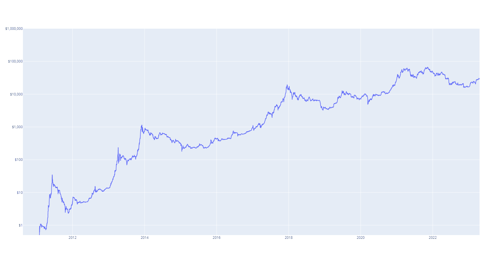
Figure 1. Historical Bitcoin Price
This chart can be broken up into periods of 4 years to highlight the 4-year cycles. The chart below depicts the 4-year price cycles from low to low as beginning on the 13th of January every 4 years.
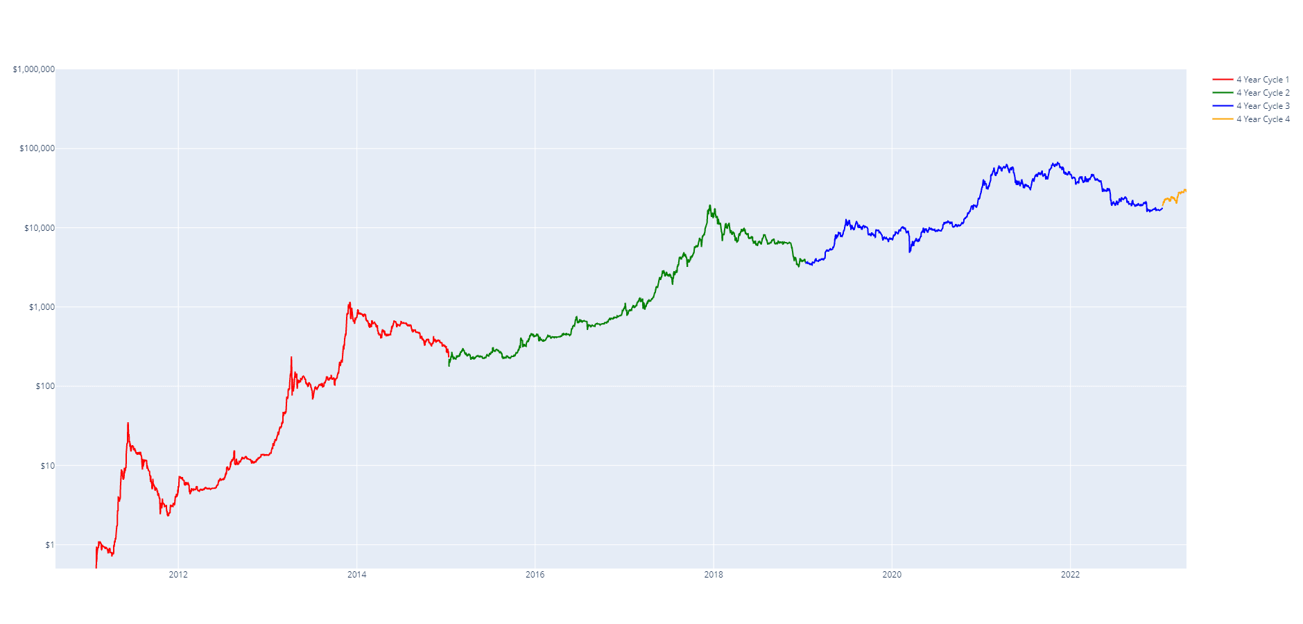
Figure 2. Highlight 4 Year Cycles
When visualised in this manner, we can also determine that each cycle top occurs at approximately the 3-year mark in each 4-year cycle. Essentially, the price rises for three years and falls for one.
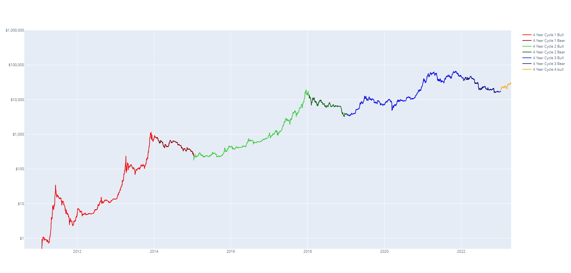
Figure 3. Highlight Bull / Bear
It should be noted that the exact cutoff dates for a bull/bear cycle or cycle start/end are not intended to predict the exact date of the top/bottom but instead are intended as rough guidelines. If working with large daily cycles instead of yearly increments (e.g. 1461 day cycle) you may be able to refine the cycle lengths to more closely predict exact dates for tops/bottoms. For simplicity, we will stick with yearly cycles.
To compare each of the bull market cycles (the first 3 years of each 4-year cycle) we can plot them on a chart as their respective returns on investment (as a multiplier) since the start of each 4-year cycle. The following chart depicts this.
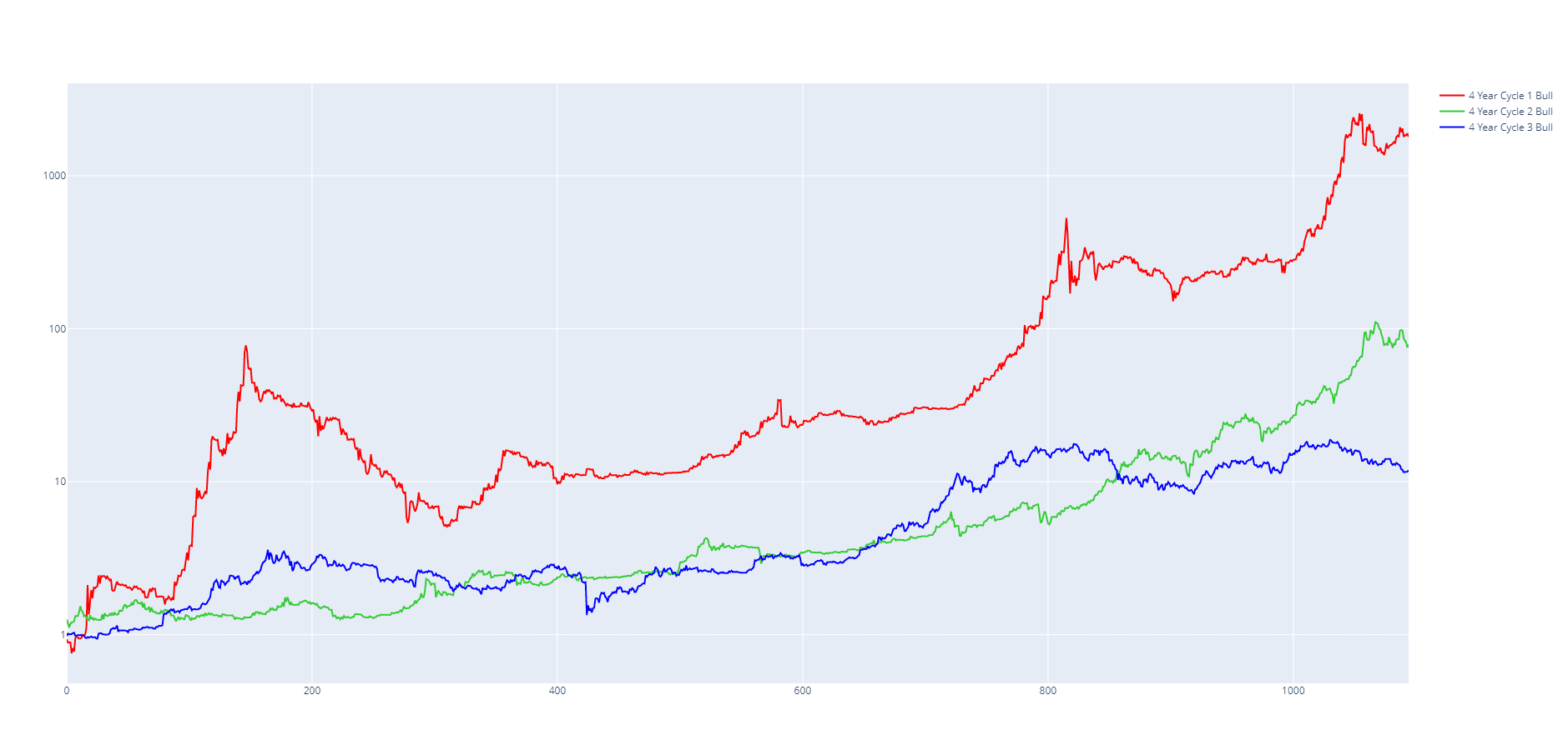
Figure 4. Return on investment for bull cycles
What we notice when looking at this chart is that each subsequent cycle peaks with a lower return on investment. This is otherwise known as diminishing returns over time. If we assume this trend is to continue, we can expect that the next Bitcoin bull market will return a lower return on investment than the previous market cycle (18x).
To account for diminishing returns and so that we can better compare the cycles we will normalise each of the cycles. This produces the following chart.
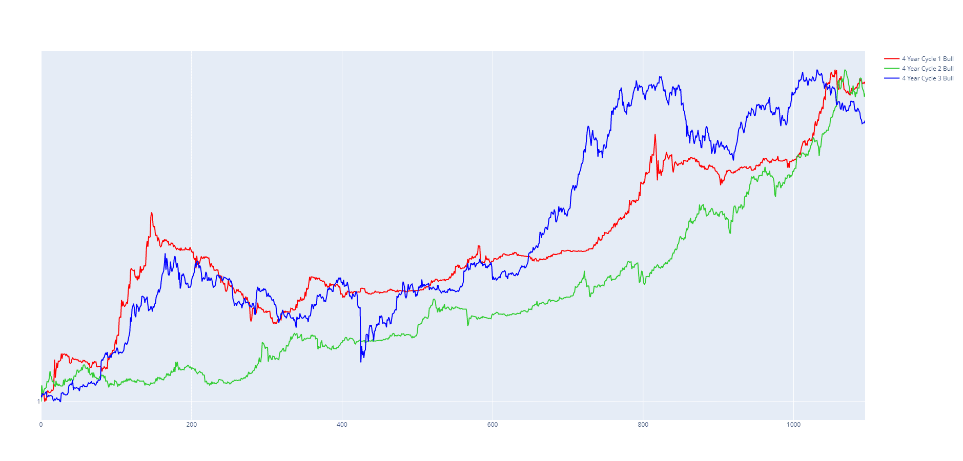
Figure 5. Normalised Bitcoin bull cycles
We can immediately notice that each of the cycles appears fairly similar. They each peak at roughly the same time and follow a similar trend throughout the 3-year period.
A key point is that we notice that each cycle experiences a mini-bubble between the 100 to 250-day mark (though it is not as prominent in the 2015-2017 bull market). When normalised it is very easy to see that these early mini-bubbles are very similar between the 2011-2013 and 2019-2021 bull market cycles. It is important to recognise that these mini-bubbles are a part of the 4-year cycle and not a separate cycle in and of themselves. Because of how rapidly Bitcoin's price was growing in the first cycle, the 2011 mini-bubble appeared so large that many interpreted it as its own complete cycle. This would lead to splitting cycle 1 into two distinct bull cycles, the first being ~0.5 years, the second 2 years and the unaffected 2015-2017 bull market remaining at 3 years. This gave rise to the popular lengthening cycles theory which predicted that Bitcoin's bull market cycles were lengthening and that each subsequent bull market would take longer and longer to reach its peak. However, this theory was proven incorrect by the 2019-2021 bull cycle which did not lengthen in size compared to the prior cycle. When normalising the bull cycles it is very apparent that each bull cycle takes roughly the same amount of time (3 years) and that the 2011 bubble was part of the 4-year cycle and not a separate cycle in and of itself.
Next, we will plot a (smoothed) average of the three bull cycles. This average represents the average value of Bitcoin at any given point during the bull market cycle. Note that this a geometric mean (not a simple average) given that the values are plotted on a log scale)
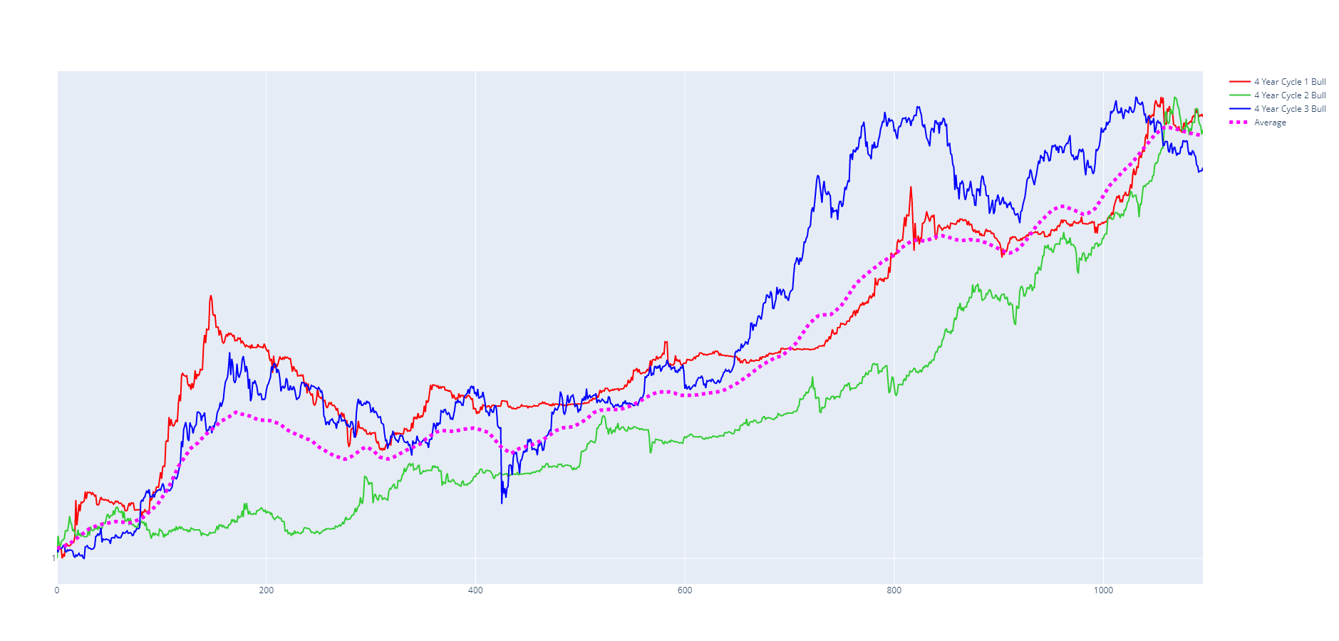
Figure 6. Average Price
The average price is a good indication of the price trend at any given point during the cycle. However, whilst the average trend is fairly accurate when compared to each of the cycles, given the volatility in the price of Bitcoin, the price can deviate significantly above or below the trend at given moments.
We can apply a catchment area above and below the average price to capture the majority of the real price action. On this scale, a catchment area of plus or minus 15% is enough to catch > 90% of all price data. Though it must be noted, this is only for this normalised scale, the 15% value is arbitrary and will not be valid on different scales.
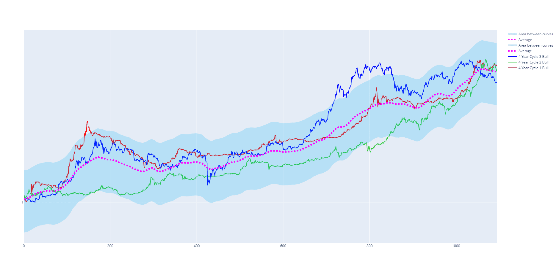
Figure 7. Catchment area
We have now created a price range where historically, > 90% of the time during a bull market, the price has traded within this range.
We can apply the exact logic above to each of the one-year bear markets to generate the following chart.
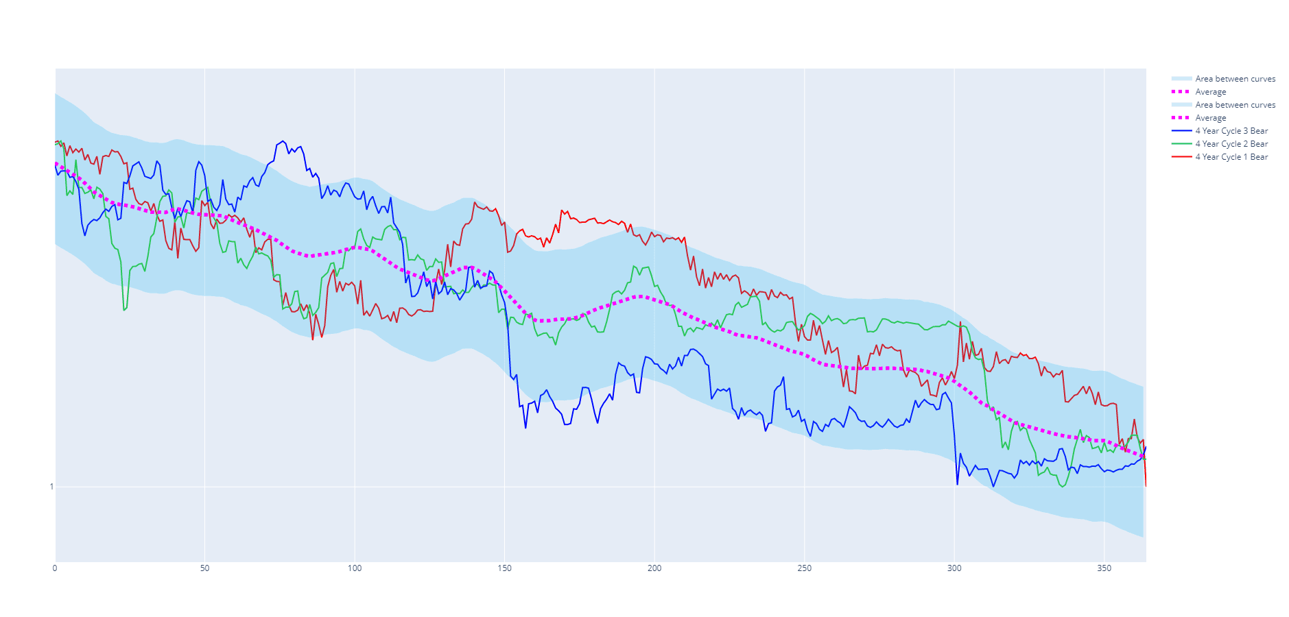
Figure 8. Bear Market Average
We now have a predicted price range for both the bull and bear cycles. However, these price ranges are normalised between 1 to 2. To attempt to predict the price of Bitcoin for the next 4-year cycle, we need to estimate the price at the end of each of the bull and bear markets.
There is no way to predict top and bottom prices with certainty, however, one way we can attempt to estimate their values is by fitting a function to previous highs and lows and extrapolating it forward. The following chart highlights lows and highs from each cycle and fits an inverse power law function for both the highs and the lows. > 87% of the time historically, Bitcoin's price has traded within the bounds of these fitted curves. We can extrapolate these curves out into the future and expect that there is a high probability that Bitcoin's price will trade within these curves in the next 4-year cycle and that the highs and lows are likely to be close to the values projected on each of these curves. These curves are also commonly known as Bitcoin's logarithmic growth curves. When fitting these curves, a total of 9 data points were used. You may be able to fit a slightly better curve by taking into consideration more data points. Given we are only looking for a rough estimate to scale our average cycle series, these curves will do.
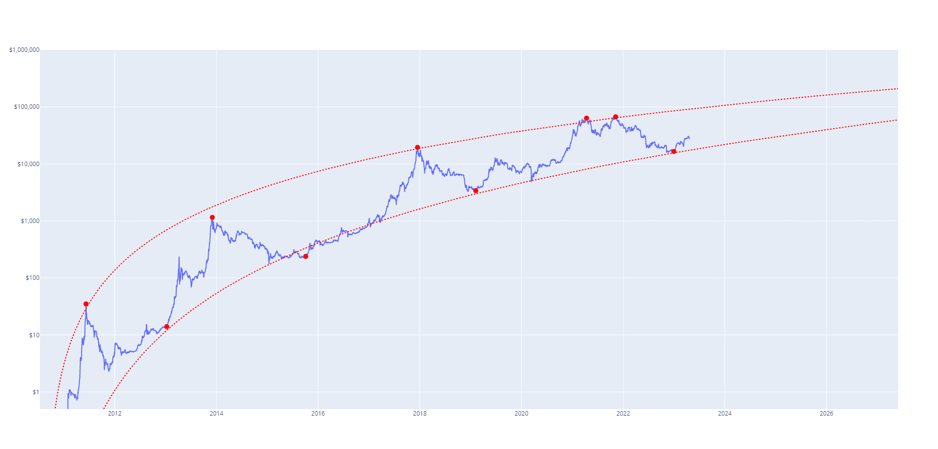
Figure 9. Logarithmic Growth Curves
We can then use the logarithmic growth curves to scale our average bull and bear cycles. The following chart scales the average bull and bear cycles (plus catchment zones) between the logarithmic growth curves starting at the 4-year cycle start date of 13th January 2023.
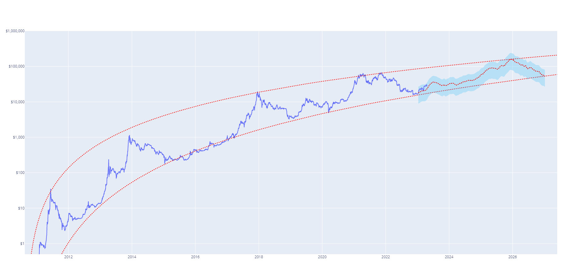
Figure 10. Predicted 4-Year Cycle
We can use this chart to estimate where the price of Bitcoin might be at any point during this 4-year cycle including when and at what price the next 4-year cycle top might be.
It is important to remember that this is just a theory and has not yet been proven correct. We will need to wait and watch the future price action unfold to determine whether this theory will prove accurate. By no means is there any guarantee that Bitcoin's price action will follow this projection. We will wait and see.